Map Marker Accuracy: Data Quality in a Mapping Survey

The project tested a simplified web map with online survey software to determine baseline error rates and expose variables associated with those errors. Across six exercises in this survey configuration, participants located the specified points correctly over 90% of the time. Zooming in was associated with higher accuracy - suggesting that changes to the configuration might help reduce error frequency. Additionally, phone and laptop users made more mistakes than desktop computer users.
These results may help us improve mapping accuracy and put the results of future research in context.
Note: this document text and most of the formatting were generated in collaboration with Claude 3.7 Sonnet. The project report it is based on, the figures, and the summary above are all my work, with acknowledgements to my advisors and practicum committee at Portland State University: Cody Evers, David Banis, Geoffrey Duh; and Esri (for the NatGeo basemap). Data were collected in April-June 2024, report completed December 2024, presented March 2025. The work was partially supported by Bipartisan Infrastructure Law project, "Fueling Adaptation: Leveraging Community Capacity to Reduce Wildfire Risk" (BIL Project Number: POC2).
Summarizing my 70-page academic report in this form seems necessary if I want to make it more accessible. This document still took some effort, but it looks much better than it would have if I had coded it by hand. Life is short.
We wanted to answer a simple question: How accurately can regular people mark locations on a map?
For this study, I adapted a web mapping tool originally developed by Dr. Cody Evers for his dissertation research. Instead of complicated GIS features, the tool uses just one input method: circles. Users can place circles to mark points or fill in areas.
Our goal was to quantify spatial accuracy when people use the simplified "Point It Out" (PIO) web mapping tool.
This study supports a real-world project: the Fueling Adaptation Wildfire Governance Survey. The survey is collecting data about wildfire risk reduction work, and we need to know how trustworthy this spatial data is.
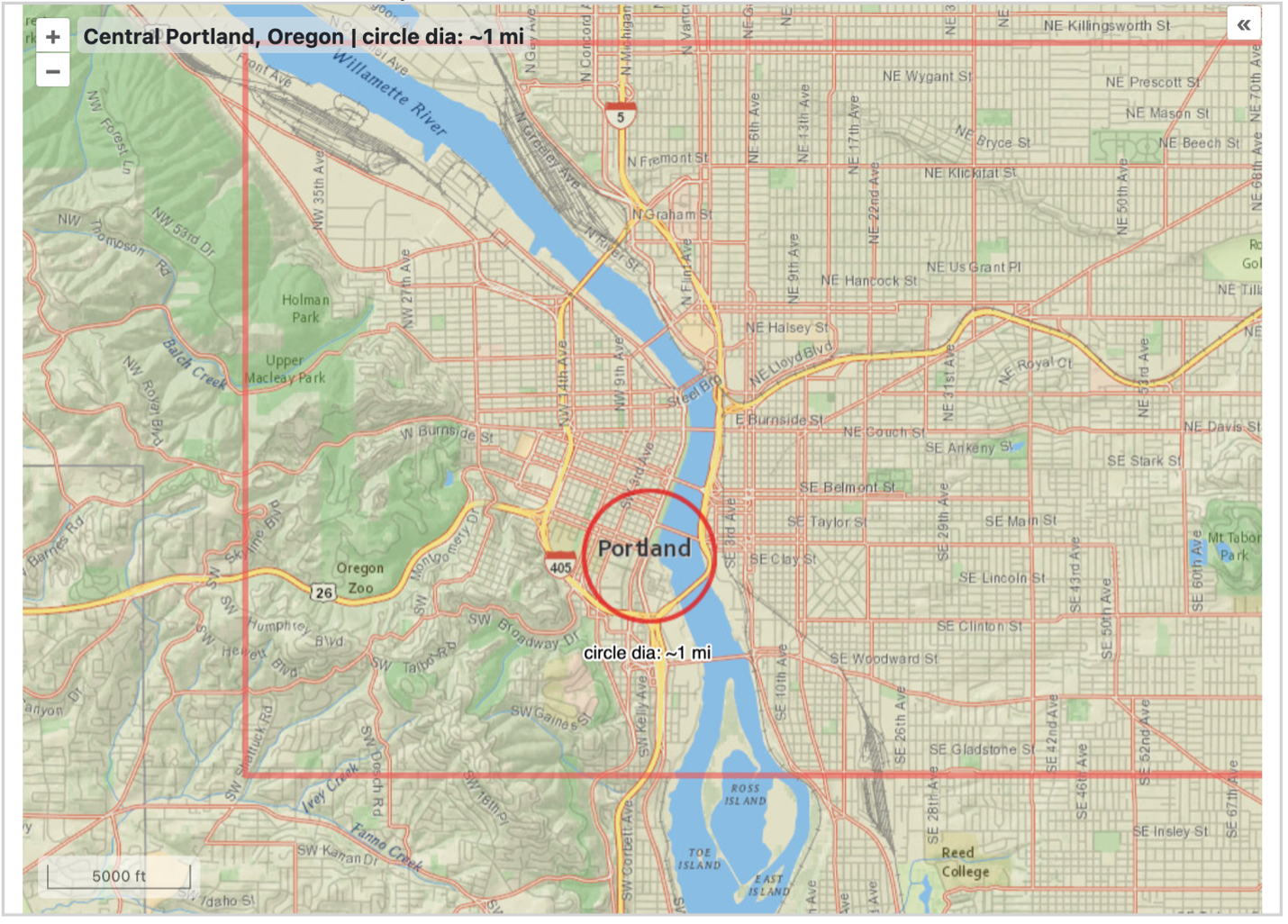
Figure 1: Our interactive map for the survey
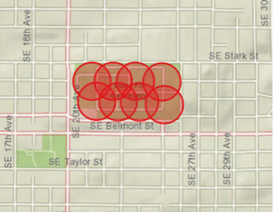
Figure 2: How users fill areas with circles
We made a deliberate choice to simplify the mapping tool to use only circular geometry. This might seem limiting, but it solved several problems:
I asked 57 volunteers to complete six mapping exercises:
The exercises varied in difficulty. Two areas (Mt. Tabor, Willamette River) were clearly visible on the map. The Pearl District, however, had no boundary shown — which proved challenging.
People were remarkably good at marking points on the map:
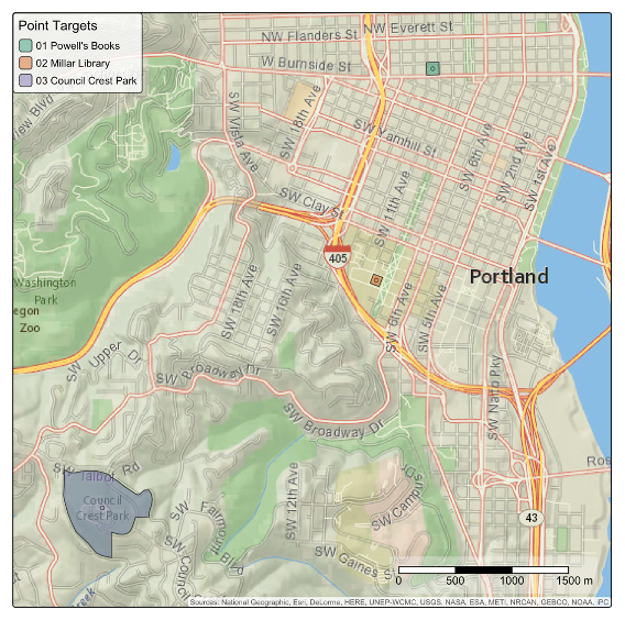
Figure 3: Our three point targets
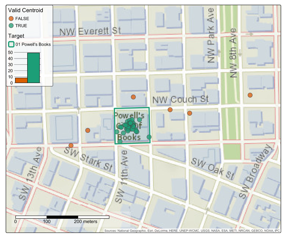
Figure 4: How accurately people marked Powell's Books
| Location | Success Rate | Comments |
|---|---|---|
| Powell's Books | 86% | First exercise after tutorial |
| Millar Library | 93% | Less famous but still well-marked |
| Council Crest Park | 93% | Larger area, still highly accurate |
| Overall | 90% | Impressive for minimal training. |
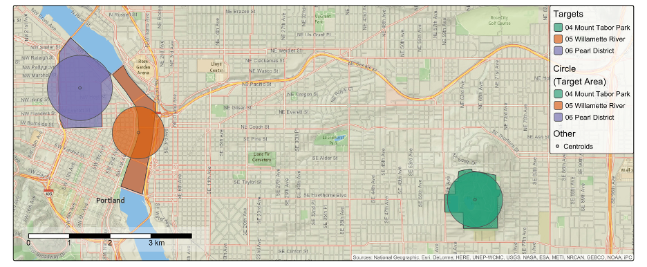
Figure 5: Our area targets
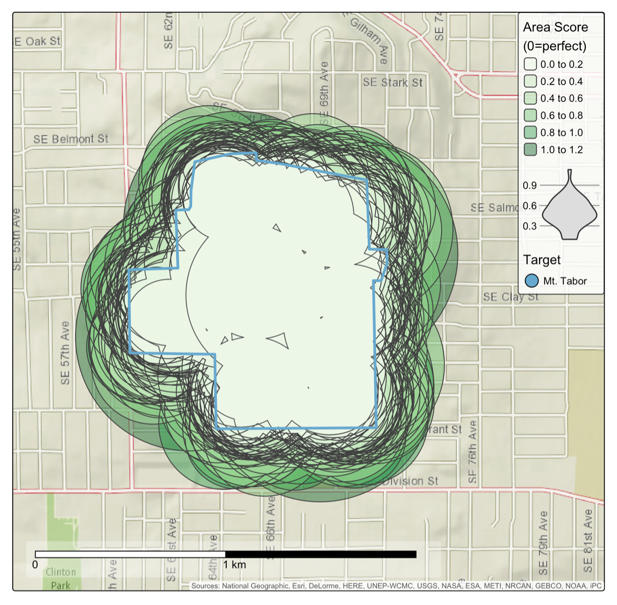
Figure 6: Top 90% of Mt. Tabor submissions
We found a fascinating contrast between areas with visible boundaries (Mt. Tabor, Willamette River) and the Pearl District (no visible boundary):
One user comment captured the challenge perfectly: "neighborhoods here have wonky and unclear borders, so what exactly are the district limits...and who cares."
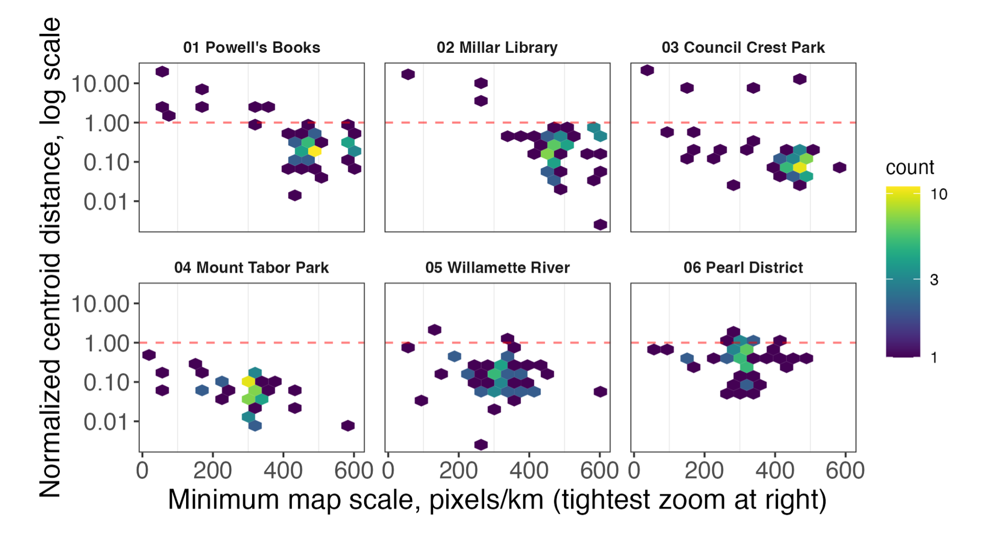
Figure 7: How zoom level affects accuracy
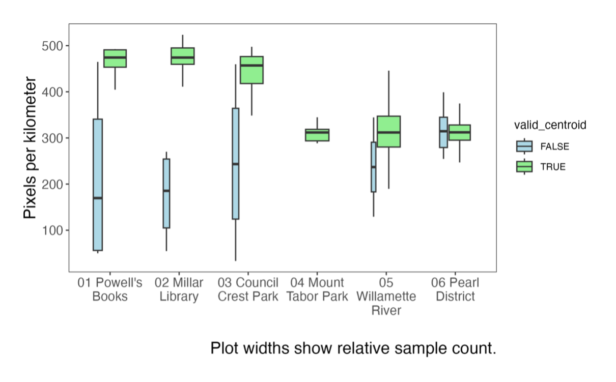
Figure 8: Valid vs. invalid submissions by zoom level
Our main takeaway: Zoom level matters. Higher zoom levels strongly correlated with better accuracy. For every 100-pixel increase in resolution, the probability of success increased by about 2.5 times.
We also found that the device used made a difference:
This makes sense — smaller screens make precise map interactions harder.
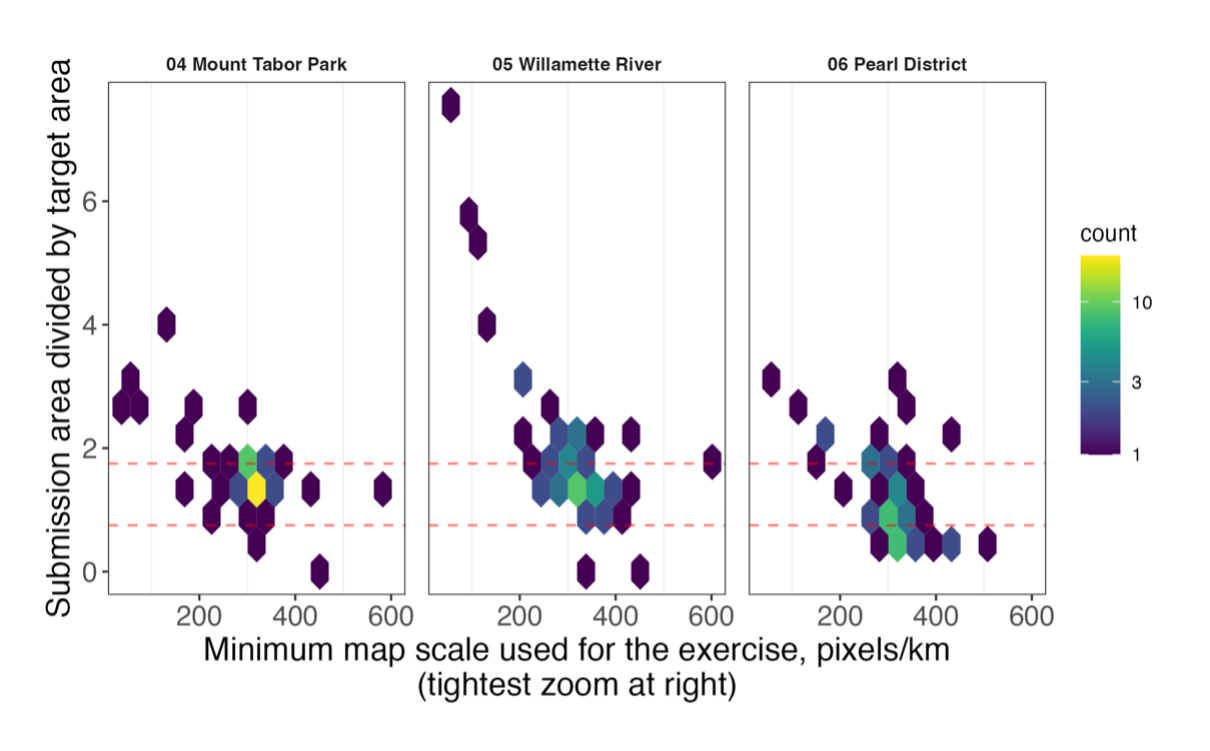
Figure 9: How zoom level affects area size
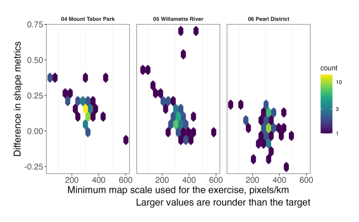
Figure 10: How zoom level affects shape accuracy
When filling areas, people showed consistent patterns:
The Pearl District results highlight an important consideration for survey design: when boundaries aren't clearly marked, people's responses will vary much more widely. This doesn't mean the data is unusable—the crowd-sourced estimate still matched the official boundary reasonably well—but it does introduce more uncertainty.
The simplified mapping interface works remarkably well. Even with minimal training, most people can accurately mark locations.
For better results in future mapping projects:
This study validates the Point It Out approach for the Wildfire Governance Survey while giving us practical ways to improve future mapping projects. The tool will continue to be used in upcoming research into land management practices, particularly in wildfire risk assessment at the Wildland-Urban Interface (WUI).